> ## Documentation Index
> Fetch the complete documentation index at: https://docs.dataerai.com/llms.txt
> Use this file to discover all available pages before exploring further.
# Visualize your data
> Explore a ready dataset with built-in charts — histograms for numeric columns and category charts for labels — without leaving Dataerai.
Once a tabular [dataset version](/datasets/overview) is **Ready**, you can chart its columns directly in Dataerai — no export, no separate tool.
## Choose a chart
Open an asset and the sidebar's **General** tab shows a preview chart. A **Visualization** dropdown lists every chart that fits the data — only the kinds Dataerai can build from the current columns appear, so you never pick one that would come up empty:
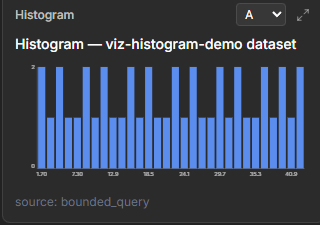
* **Histogram** — the distribution of a single column's values.
* **Table** — a row-level preview of the data.
* **Scatter** — one numeric column against another.
* **Time series** — values traced in order, for sequential or time-based data.
* **Distribution** — box, violin, or bar charts grouped by a category.
* **Heatmap** — a matrix or density grid across two columns.
Pick the chart you want from the dropdown. If you can edit the asset, choose **Set as default** to remember that choice for everyone who opens the asset later.
For a tabular asset, Dataerai prepares the chart automatically: select the asset and a preview appears once its dataset version is ready.
## Delete an asset with generated visualization data
When Dataerai prepares charts for a tabular asset, it may create an auto-promoted dataset version for that visualization. If you delete the asset later, the confirmation dialog includes **Also delete auto-promoted visualization dataset versions?**. The option is selected by default so the generated visualization data is removed with the asset.
Clear the option if you want to stop and review linked dataset versions before deleting the asset. Dataset versions that were not auto-promoted for visualization still protect their source asset and must be removed separately.
## Pick a column, get a chart
Select a column and Dataerai chooses the right chart for its type:
* **Numeric and date/time columns** render as a **histogram** — the distribution of values across bins.
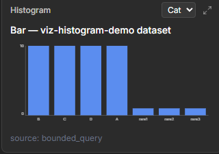
* **Categorical and text columns** render as a **bar chart of category counts** — the most common values.
 ## Relate two columns
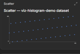
Beyond single-column distributions, Dataerai charts relationships between columns — a **scatter** plots one numeric column against another, so you can spot correlations and outliers at a glance. Add an optional **color** column to shade the points — by category for a label column, or along a gradient for a numeric one — so a third dimension reads at a glance.
## Relate two columns
Beyond single-column distributions, Dataerai charts relationships between columns — a **scatter** plots one numeric column against another, so you can spot correlations and outliers at a glance. Add an optional **color** column to shade the points — by category for a label column, or along a gradient for a numeric one — so a third dimension reads at a glance.
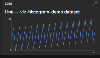
 A **time series** chart traces values in order — useful for time-based and sequential measurements. Choose an **aggregation** (none, mean, sum, median, or count) to collapse repeated x values into a single point per step.
 ## Compare distributions across groups
When your data has a category to group by and a numeric value to summarize, a **distribution** chart compares groups side by side. Switch between three views:
* **Box** and **violin** plots show the spread of values within each group.
* **Bar** charts aggregate each group into a single number — choose **count**, **mean**, **median**, or **sum**.
## See a matrix or density grid
A **heatmap** renders a two-column grid:
* With two categorical columns, it builds a **pivot matrix** — one cell per pair of categories.
* With two numeric columns, it builds a **density grid** — useful for spotting where values cluster.
Optionally color the cells by an aggregate of a numeric **value** column (count, mean, median, or sum), and switch the **colour scale** to suit your data.
## Adjust the view
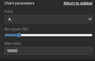
Open the full chart to tune it with a live parameter panel. The controls match the chart you're viewing:
* **Bin count** — how many bins a numeric histogram uses.
* **Top categories** — how many categories a category chart shows.
* **Max rows** — the amount of data scanned for the chart.
* **Group**, **value**, and **aggregation** — for distribution and heatmap charts, the columns to group by and summarize.
* **Colour scale** — the palette a heatmap uses.
Changes apply live as you adjust them.
## Compare distributions across groups
When your data has a category to group by and a numeric value to summarize, a **distribution** chart compares groups side by side. Switch between three views:
* **Box** and **violin** plots show the spread of values within each group.
* **Bar** charts aggregate each group into a single number — choose **count**, **mean**, **median**, or **sum**.
## See a matrix or density grid
A **heatmap** renders a two-column grid:
* With two categorical columns, it builds a **pivot matrix** — one cell per pair of categories.
* With two numeric columns, it builds a **density grid** — useful for spotting where values cluster.
Optionally color the cells by an aggregate of a numeric **value** column (count, mean, median, or sum), and switch the **colour scale** to suit your data.
## Adjust the view
Open the full chart to tune it with a live parameter panel. The controls match the chart you're viewing:
* **Bin count** — how many bins a numeric histogram uses.
* **Top categories** — how many categories a category chart shows.
* **Max rows** — the amount of data scanned for the chart.
* **Group**, **value**, and **aggregation** — for distribution and heatmap charts, the columns to group by and summarize.
* **Colour scale** — the palette a heatmap uses.
Changes apply live as you adjust them.
 Large datasets are automatically **sampled** so charts stay fast and responsive. When a chart is based on a sample, you're working with a representative subset rather than every row.
## Preview the rows
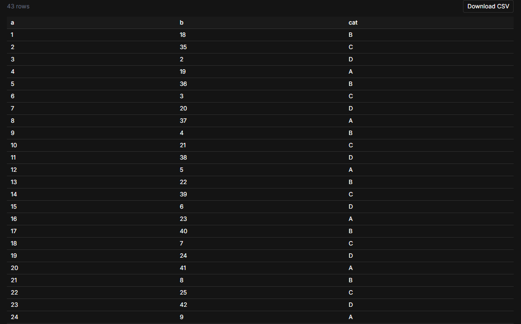
Alongside the charts, you can preview the dataset's **rows** as a table to see the actual values behind a column — useful for sanity-checking before you read too much into a distribution.
Large datasets are automatically **sampled** so charts stay fast and responsive. When a chart is based on a sample, you're working with a representative subset rather than every row.
## Preview the rows
Alongside the charts, you can preview the dataset's **rows** as a table to see the actual values behind a column — useful for sanity-checking before you read too much into a distribution.
 ## Next steps
The schema and statistics behind the charts.
Find the data you want to chart.
## Next steps
The schema and statistics behind the charts.
Find the data you want to chart.